Friday, May 30, 2014

Best & Worst Three-man Line-ups (2013/14 Playoffs)

Below are the best and worst three-man line-ups in the playoffs as of last night's game based on player impact estimate (PIE) and net rating (both standardized per 48 minutes of play). I pulled data from NBA stats (which limits each combination of three-man line-ups to 250).


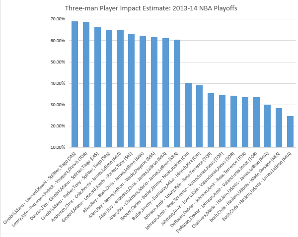
As expected, three-man rotations from either the Spurs or the Heat take all of the top ten positions, with the exception that Lowry, Patterson and Vasquez, who had the second highest PIE. The ten worst PIEs are dominated by Bulls and Raptors, two first round exits. Surprisingly, the three worst PIEs are Heat rotations that include Udanis Haslem.


The net rating chart essentially mirrors the PIE chart with the exception that Lowry, Patterson and Vasquez dropped from second to sixth best. The fact that Udonis Haslem is the consistent piece (with otherwise extraordinary players) in the three worst PIEs and net rating for these playoffs signals the value of Chris Andersen's return (not necessarily because he is so valuable, but because Andersen is simply not Haslem).

Friday, May 9, 2014

2013-14 Distance-Adjusted FG%

There are several advanced measures of field goal percentage (FG%), such as effective FG% (eFG%) and True Shooting % (TS%) that add value for made three point FGs (3FGMs), in the case of eFG%, or 3FGMs and free throws (FTs), in the case of TS%. But I have not encountered any measure that takes into account distance. Presumably the further the field goal attempt (FGA) from the basket the lower the likelihood that the attempt is made. I pulled 2013-14 regular season data from NBA Stats on FG% by distance and plotted the results below. The league FG% (orange line) is 45.6%. FG% is highest within 5 feet of the basket (59.0%) then drops 20 percentage points once a shot is attempted from 5-9 feet from the basket and hovers around that level for all attempts within 24 feet. Attempts from 25-29 feet drop to the lowest FG% by a five foot increment (34.5%).


I wanted to standardize FG% based on distance so I used the FG% from within five feet of the basket as the base. Then I established a factor for each five foot increment based on the league-wide FG% within five feet divided by the league-wide FG% in a given five foot increment. The orange line in the chart below shows that in the 2013-14 NBA season, players were 1.51 times more likely to make a shot from less than five feet than they were from 5-9 feet from the basket. Likewise they were 1.71 times more likely to make a shot from less than five feet than they were from 25-29 feet from the basket.


I then applied the distance factor to each player's FGMs by five foot increment. I kept the FGA for each increment the same, thus the distance factors would inflate the FGMs and FG%. (In other words, for every play from 5-9 Feet I multiplied their FGMs by 1.51.) The chart below illustrates the effect this distance-weighting had on John Wall. As a guard he attempts more shots from further away from the basket so such a weighting system is expected to increase his FG% considerably (and, sure enough that is what happened). In weighting his FGMs based on the distance factors for each five foot increment (column DAFGM), Wall's Distance Adjusted FG% (DAFG%) increases for every five foot increment with the exception of less than five feet, which serves as the basis. Overall his FG% increases from his actual percentage of 43.7% to a DAFG% of 57.1%.


To give some scope on why it is worth considering a DAFG%, look at the chart below of the top ten and ten worst FG%s from 2013-14 (minimum 100 FGAs). All of the top FG% players are centers that only take shots close to the basket, and the worst FG%s are guards that rely more on longer jump shots.


The next chart shows the top ten and ten worst DAFG%s from 2013-14 (minimum 100 FGAs). While many of the poor shooting guards from the above chart remain, several guards and jump shooting forwards, like Korver, Nowitzki, Miller, Prigioni, Pargo and James, emerge as top distance-adjusted shooters.


Finally, it is important to understand the relationship between FG% and DAFG%. The chart below, which includes an orange linear regression line, illustrates that the two are highly correlated. Another way to interpret this, is that DAFG% does not revolutionize how we understand shooting efficiency. It largely reinforces what conventional measures already tell us. But, the chart immediately above shows that DAFG% also can grant insight on especially efficient guards and forward, who may not be recognized by conventional FG% measures simply because they take longer shots.