Tuesday, December 23, 2014

Special guest post: TERP ALERT!!!!

Like the Championship team of 2002, this year's Maryland Basketball team is big and deep.  The interesting thing is that it has the potential to be as talented.  Think about it, big, deep and possibly talented like our championship team. Wow.

Let's take a quick look at a specific player who will help make that possible. We have Melo Trimble, the pg county freshman who is playing like one of the best point guards in the country who can be an NBA guy. But I'm not talking about him. Or Dez Wells, the Naismith 50 finalist who might be an NBA guy. Or Jake Layman, the 6'9 crazy athlete with a nice jump shot who was co-Big Ten player of the week who can be an NBA guy. Or our 7 foot freshman,Michal Cekovsky, who is better now than Alex Len was at the same time in his career (Len was an NBA lottery pick).

Orrrrrr . . . Richaud Pack, the seasoned transfer playing his last year of eligibility and  silently guiding this team with defense and calming smarts. Or Dion Wiley, another Prince George's County freshman guard who can shoot, has size, and is confident. Or Evan Smotrycz, a 6'9 shooter....or Damonte Dodd, our starting 6'11 center who defends the rim...or 6'9 hustle guy Jonathan Graham.

I'M TALKING ABOUT JARED NICKENS.  The 6'7 freshman who's been starting at the three while Dez Wells has been hurt. I'm not saying he's better than Dez overall, but he handles the ball better and has a better stroke than him right now (note his Juan Dixony release). Here's a video from a weekend tournament last year against solid high school opposition over 3 games:


If you don't love him throwing the subtle jab at the west coast while talking about how it's "fun" to play against the best competition, then you don't love hoopin'.
While Dez is physically gifted, he gives occasional glimpses of season's past with a spazz out here and a wtf was that there.  Nickens is a glimpse of the future, filled with mega cool and specific to basketball talent.   

That's not to say that we shouldn't look forward to Dez returning.  He's a beast and we need him.   But the more I see Nickens either making 3's or almost making 3's coupled with his lack of turnovers and enjoying defense, I'm starting to wonder how bad of a thing to the program Dez's injury is.
And he was supposed to be our best player.

Whoa - Maryland is back in a big way.  

Go terps.

Special guest post by the luminary John Beckham

Monday, December 8, 2014

Relationship between advanced stats and winning

While a growth in advanced metrics provides a more robust picture of a player's value, the true measure of a metric should be it's ability to correlate with his team winning. I took six advanced metrics from basketball-reference.com for the 2014-15 season* and focused on only players that had played a minimum of 100 minutes this season through the December 5 games (this resulted in a population of 342 players). 

I compared each player's team's winning percentage (win %) with i) usage %, ii) player efficiency rating (PER), iii) true shooting % (TS%), iv) box plus-minus, v) value over replacement player (VORP) and vi) win shares per 48 minutes (WS/ 48). The definition for each are pulled mostly from basketball-reference.com's glossary. Below each definition the specific matrix is plotted on the vertical/ y axis and win % is plotted on the horizontal/ x axis. 

Each blue dot represents one of the 342 players that qualified. I included a yellow linear regression line to exhibit the direction of the relationship. If there is a very strong relationship between the metric and win % then the yellow line will begin at the bottom left of the chart and rise steeply to the top right of the chart, which would indicate that as the metric increases so too does win percentage. I include an R-square to indicate how well the model fits the data (or how well the metric explains win %). The lower the R-square means that the metric does a poorer job explaining win %.

Usage %Usage Percentage (available since the 1977-78 season in the NBA); the formula is 100 * ((FGA + 0.44 * FTA + TOV) * (Tm MP / 5)) / (MP * (Tm FGA + 0.44 * Tm FTA + Tm TOV)). Usage percentage is an estimate of the percentage of team plays used by a player while he was on the floor.


PER: A per minute rating that adds accomplishments and subtracts failures (see formula here).


TS%True Shooting Percentage; the formula is PTS / (2 * TSA). True shooting percentage is a measure of shooting efficiency that takes into account field goals, 3-point field goals, and free throws.


Box plus-minus: A box score estimate of the points per 100 possessions a player contributed above a league average player, translated to an average team.


VORP: A box score estimate of the points per 100 team possessions a player contributed above a replacement-level player, translated to an average team.


WS/ 48: An estimate of the number of wins contributed by a player per 48 minutes (league average is approximately .1000).


The above shows that while all six of these advanced metrics has a positive correlation with team win%, usage, PER and TS% are weakly related (they have relatively flat lines). Box plus-minus, VORP and WS/ 48 have a stronger positive relationship but the r squares indicate that they only explain ~15-18% of the relationship between the specific metric and team win %. However the includes a player's team's wins are included as a component in the formula for ws/ 48, thus the stronger positive correlation and larger R-square with ws/ 48 are expected. As a result, box plus-minus and VORP, which includes box plus-minus in its formula, should be considered the best metrics in terms of correlating with team win % that don't also include a team's wins in the formula (based on this small sample).

*A major limitation of this approach is that it focuses only on one incomplete season (2014/15). I will try to run a similar analysis on these metrics over several completed seasons, which should give a more accurate picture of the correlation with winning. 

Sunday, November 30, 2014

Scoring efficiency (PTS/ FGA)

There are many measures of shooting efficiency however one that tends to get over-looked is the most simple--points (PTS) per field goal attempt (FGA). The measure is intuitive and gives some context on players that are effective three points scorers or score from the free throw line. (A limitation of this measure of efficiency is that it disproportionately benefits players that are frequent and efficient free throw shooters because a foul on a non-scoring shot can result in two or three points and zero FGA.)

I pulled data from basketball-reference for all games as of November 26, 2014 and calculated PTS/ FGA. Below is a chart that captures the 367 players with at least 10 FGA this season. Clearly, there is significant variance between the five best players, who average almost two points per FGA, and the five worst players, led by Kyle Anderson, who averages a quarter of a point per FGA. But outside of Brandan Wright, all of the names listed below have relatively few FGA.


So next I filtered the population down to the 24 players with 200 FGAs or more. This second chart shows that among these high frequency shooters, James Harden and Anthony Davis are the most efficient scorers and that Kobe, Serge Ibaka and Kemba Walker are among the least efficient. (The fact that James Harden is ranked the most efficient reflects the deficiency in this measure--he leads the league in FTA and is an exceptionally efficient free throw shooter at ~90%. However Kobe is second in FTAs but his ~79% FT shooting can't compensate for his pedestrian non-FT shooting.)  

To give some context to this chart the league average for PTS/ FGA is 1.22 (median is 1.20) so every player from John Wall down is below the league average in terms of efficiency. While below league-average PTS/ FGA efficiency may be a concern for big men, like Aldridge, Griffin and Jefferson, point guards, like Wall and Walker, can point to the fact that they also benefit overall team scoring efficiency through assists.

Friday, November 7, 2014

Kobe: Career 50 Game Moving Averages

After the most recent 14 for 37 shoot-first-ask-questions-last loss, I started thinking that 2014 Kobe might simply be a bad player that gets to shoot a lot. In other words, offensively, he produces what any marginal NBA player would given the green light to shoot the ball 30+ times a game. But I wanted to understand if the data supported this perception. There are countless approaches to measuring this, and the greatest challenge of measuring my perception of Kobe's contemporary futility is that he has only played 11 games over the last two seasons so I'm dealing with an admittedly small sample size to account for 'current' performance.

One way to address this is to create a moving average of his past performance. I pulled all of Kobe's regular season game logs from basketball-reference.com and included only games in which he appeared (as of his last game on Tuesday night, Kobe has appeared in 1,250 regular season games). The benefit of a moving average is that it smooths performance (in this case over a 50 game period) so anomalously exceptional or futile performances are regressed to the mean of the 49 previous games.

To create the moving average I don't report Kobe's first 49 games because "game 1" is essentially the mean of his first 50 games. ("Game 2" is the mean of games 2 through 51, "game 3" is the mean of games 3 through 52, etc.) I created a moving average for FG%,  assists, points, total rebounds, and steals (all plotted below). I also included his career regular season average in each of those categories to provide some context. What does it show? First, that it took Kobe a few years to adjust to the NBA game as he has a sharp increase in every category for his moving average games 0 to about 400. This is expected as he was drafted out of high school and he received significantly less playing time his first three seasons.

If Kobe was truly becoming an ineffective player then we would expect each chart to show somewhat of a bell curve where the plot rises from early-career inefficacy to a mid-career peek and then drops to reflect a current state of inefficacy. But that doesn't happen. For the most part Kobe is right around his career average in these conventional statistics with the exception of assists where he is becoming much more prolific relative to the rest of his career.


Friday, September 26, 2014

Offensive and Defensive Rating & Win %

Looking at team data, I was interested in understanding how effective team offensive and defensive rating serve as a measure of success. Offensive rating measures a team's points scored per 100 possessions. Conversely, defensive rating measures a team's points allowed per 100 possessions. To measure success I used regular season win %. I pulled historical team data from the 1950-51 through the 2013-14 regular seasons from basketball-reference.com. Because basketball-reference.com doesn't provide raw data for analysis, I used excellent code I found here*, which allowed me to loop the URLs for all teams for all seasons.

Before I simply plotted individual team offensive and defensive rating, I looked at the league average for each measure over the last 63 seasons to see if there was a trend. The chart below, which plots NBA regular season mean offensive rating on the left side and mean defensive rating on the right side illustrate two things. First, the ratings mirror each other. This makes sense because for one team to have a more offensively productive season there has to be another team(s) that gives up those points. When aggregated across the league for a given year the offensive and defensive ratings become quite close (usually the difference is tenths or hundredths of a point).

Second, and more importantly, from the 1950s until the early 1980s NBA offensive production soared from about 85 points per 100 possessions to about 108 points per 100 possessions. (The NBA shot clock was introduced in the 1954-55 season so its not like a technical rule change was responsible for this increase.) This high offensive output plateaued in the 1980s and 1990s, but dropped to about 100 points per offensive possession in the late 1990s and early 2000s. By the mid-2000s it picked up slightly but even last season is about 5 points per 100 possessions off the league mean peak established in the 1980s and 1990s. (So defenses appear to be adjusting to prolific offenses.)

The chart below matters because I cannot simply plot a team's offensive or defensive rating for a given season against win % because there were teams in the 1950s and 1960s that had a  high win % but had a much lower offensive rating than teams that played in the 1990s (that had a low win % but had a higher offensive rating) on account of the offensive zeitgeist of the 1990s. (In other words, I had to take into account the change in league-wide scoring over time.)


To account for the increase in scoring over time, I used relative offensive and defensive rating, which simply subtract a team's offensive/ defensive rating from the league mean for that specific season. As a result, it would be clear that a team in 1958 with a relative offensive rating of +10 (or about 100 points per 100 possessions) was better offensively than a team in 1988 with a relative offensive rating of -8 (which is also about 100 points per possession). The two plots below chart relative offensive rating (left side) and relative defensive rating (right side) against win % for all NBA teams that played from the 1950-51 season through the 2013-14 season. I included a blue regression line to help illustrate the relationship. Clearly, relative offensive rating is very positively correlated with win % and relative defensive rating is very negatively correlated with win %. Both make intuitive sense.


Looking at the plots, I was interested in those anomalies over the last 63 years. Below is the same plot on relative defensive rating but without the color and regression line. I identified those teams that were exceptionally deficient or successful. In terms of relative defensive rating, some of the worst teams in the history of the NBA were the 1998-99 Denver Nuggets, the 1981-82 Denver Nuggets, and the 2011-12 Charlotte Bobcats (the Bobcats set the NBA record for the worst win % this season). Some of the best ever were the 1995-96 Chicago Bulls, the 2007-08 Boston Celtics, and the mid-1960s Boston Celtics.


The best teams historically in terms of relative offensive rating were the 2003-04 Dallas Mavericks, the 2004-05 Phoenix Suns and the 1995-96 Chicago Bulls. Some of the most offensively deficient ever were the 1998-99 Chicago Bulls, the 1987-88 LA Clippers and the 2002-03 Denver Nuggets. It should come as no surprise that in the 1995-96 season when the Chicago Bulls set the NBA regular season record for wins (72) they were one of the best offensive and defensive teams relative to all other teams in the that season in the history of the NBA.


*One of the many amazing things about the internet are sites, like stackoverflow or github, that allow very smart people to share or explain complex coding just because they want to help people or to solve challenging problem (or, presumably--for some--for validation/ recognition).

Wednesday, September 3, 2014

Melo & LeBron: Career 30 game moving averages

Carmelo Anthony is a unique player in the NBA in that he is granted superstar status and money despite only reaching the conference finals once in his 12 year career. His critics have questioned his effort on defense and the adverse effect of his individual offensive play on his team. All this begs the question: Is Carmelo Anthony really a superstar? Considering that a big part of being a superstar in the NBA is fan appeal and scoring--two criteria Carmelo certainly exceeds in--the answer is 'yes'. However I'm interested if he will at the minimum maintain his offensive output when he begins his first full season as a thirty year old. To get a better picture of his performance I collected data on each of his regular season games over the course of his entire career from basketball-reference.com.  

I focused on three conventional statistics--points, field goal attempts (FGA) and plus/ minus. I wanted to see how he progressed in each statistics from his first regular season game to his most recent. I only included games where he played at least one minute which resulted in a population of 708 games. Simply plotting these three conventional statistics in chronological order from game 1 to game 708 would have created a visual mess as the variance between individual 'good' and 'bad' games would have had lines darting everywhere.

As a result, I took a technique common in stock charts to smooth the performance. I captured a moving 30 game average of  each statistic. This technique allows me to chart his performance over a sufficient amount of play, thus giving a better understanding of sustained performance as opposed to capturing anomalous high/ low output performances. To create the moving average, I did not include Carmelo's first 29 games of his career because those games are necessary (with the 30th game) to create the starting point for the 30 game moving average. As a result, the charts below actually capture 679 games (708 career games - Carmelo's first 29 games).

To give some idea as to how the chart progresses, the point for game 2 on the plot represents the 30 game average from his career game 2 through game 31. Point 3 represents the 30 game average from his career game 3 through game 32. All the way up to the final point, which represents the 30 game average for his career game 679 through game 708. (Obviously, all points are connected with a line.)

The top chart shows Carmelo's 30 game moving average for FGA (black) and points (grey). I included a dashed line signaling his career regular season average in points (25.3) and FGA (19.7). As expected Carmelo started off slow in his career, which makes sense because he was a rookie adjusting to the NBA. He appears to have peaked around his 200th game and outside of his rookie season his output reached its nadir around the 30 game moving average of 550, which coincides with his first season with the Knicks. Throughout his career his FGA and points seem to mirror each other, which also makes sense--you gotta take shots to make shots.

But if you look closely at the chart something else emerges--Carmelo needs a lot of shots to score all his points. Since he began his career with the Knicks (around what would be 550 on the horizontal axis) he appears to score only about five more points that FGA. Considering that he only averages about 3 assists a game this could challenge his efficacy as on offensive player.


But points and FGA can belie actual performance, especially if a player's teammates are of limited offensive means. The 2013-14 Knicks were certainly one such team as they had to rely disproportionately on Carmelo for offense. Opposing teams knew this and, thus, made it more difficult for him to succeed offensively. 

Plus/ minus is a very rough measure of overall performance but it does give some context as to the effect the player had on the outcome of the game while he was on the court. Carmelo's career plus/ minus average is 2.4 and the chart below shows that his 30 game moving average peaked at 7.9 and bottomed out at -3.5. Interestingly if you compare the chart below with the chart above, especially early in his career, Carmelo's plus/ minus appears indirectly related to his point/ FGA. In other words, the more he shot and scored the worst plus/ minus he had. 

Over the last 150 or so games of his career (almost his entire time with the Knicks), Carmelo seems to have fallen into a zone that hovers right around his career plus/ minus average of 2.4. In light of his prolific scoring, it is fair to question if a player that contributes just less than 2.5 points to the outcome of a game is worthy of the 'superstar' designation. 


Looking at just one player is limiting as it grants no context in comparison to the performance of others. As a result, I created the same charts for The superstar--LeBron. There is no comparing the two players as by every objective measure LeBron is a superior player. However, if a player, like Carmelo, is deigned a superstar then his performance should be measured against the highest criterion--LeBron.

For LeBron, I pulled the same data from basketball-reference.com and conducted the same analysis as I did for Carmelo. (Because LeBron has player one more season, he's played at least one minute in 842 regular season games.) The chart below shows LeBron's career regular season 30 game moving average for points (grey) and FGA (black). There is clearly a wider margin between the two lines than there is for Carmelo, which indicates that LeBron needs fewer shots to score points. In fact, by the time he reaches Miami (around 500 on the horizontal axis) he appears to score 10 more points than FGA. 

The final chart shows LeBron's career 30 game moving average for plus/ minus. LeBron's career regular season average plus/ minus of 5.4 is clearly negatively skewed by his early days in Cleveland. In fact, during his last few seasons in Miami he appears to have a plus/ minus consistently between 5 and 10. (Not to mention an exceptional plus/ minus peak of 14.9 toward the end of his first stint with the Cavaliers.) 

While LeBron was certainly surrounded with better talent in Miami than Carmelo was in New York during the 2013/14 season, one cannot ignore that LeBron's 30 game moving average plus/ minus over the last few seasons hovers around Carmelo's career peak. Again, the point isn't to compare Carmelo and LeBron as individual players. The point is to give some context of the performance of one player perceived as a superstar (Carmelo) with the NBA's greatest performer (LeBron) based on empirical data. Further, all of this ignores marketing factors and fan popularity, which can play an equally critical role is designating a player as a superstar.

Thursday, August 14, 2014

Curreally? Better offense than LeBron

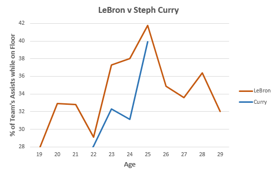
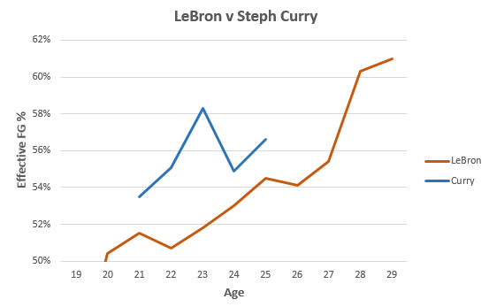
Stephen Curry recently said that he was a better offensive player than LeBron. Here's why he's not:


Based on virtually every measure of offensive performance (i.e., assist %, offensive rating, offensive rebounding %, and offensive win shares), LeBron is better, and by a noticeable amount. (Data pulled from basketball-reference.com.) The one area where controlling for age that Curry might have an argument is effective FG %, but if you look at current performance LeBron far exceeds him.


Friday, July 25, 2014

Best Available Free Agents

I pulled current free agents from here and win shares per 48 from basketball-reference.com. Duncan, Bosh and James Jones are the best available. Udoh, Watson and Billups are among the worst available. Interestingly, Jan Vesely is above Rudy Gay, Bargiani, Evan Turner and Ridnour.


Monday, July 21, 2014

Kevin Love, AFGM & 3s

There's an increasing sense of inevitability of success associated with Kevin Love and whatever team he joins. I pulled monthly averages for his career from NBA Stats, and plotted the percent of three point field goal attempts (%FGA 3PT) and the percent of his made field goals off of an assist (FGM %AST). While he puts up phenomenal statistics in Minnesota, his game has progressed to that of a superior rebounder on defense and a set three point shooter on offense. The state of his offensive game suggests he would prove much more valuable in Cleveland where he could spread the floor for LeBron while also giving them some much needed long distance shooting than he would in Golden State where he would add yet another three point shooter without adding to their anemic post offense. Further, his increasing reliance on assists for made field goals indicates he needs to be set-up to score, thus making Cleveland and LeBron the preferable fit for Love.


Monday, June 30, 2014

Why LeBron leaves

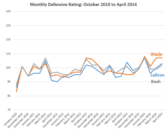
I pulled monthly split stats from Basketball-Reference.com on LeBron, Dwade and Bosh going back to the three's first season with the Heat. Below I charted their monthly offensive rating (an estimate of the points produced by a player per 100 possessions) and defensive rating (an estimate of the points allowed by a player per 100 possessions). Because these three are all starters and play the bulk of the Heat's minutes together, you would expect their ratings to mirror each other (the calculations takes into account several team statistics).

Offensively, over the last two years LeBron has really begun to distance himself from the other two. Further, DWade has exhibited a noticeable decline that began March 2013. Defensively, the three stars follow a much closer path, but again DWade appears to struggle recently more so than the LeBron and Bosh (in the bottom chart, as it is preferable to allow fewer points, the lower the line the better). Should LeBron stay in Miami these charts suggest he will be expected to carry an increasing load for the other Big Two as their performance wanes.


Saturday, June 21, 2014

Spurs, passing & distance

There was much emphasis--and a surprising number of highlights and GIFs--on the Spurs' exceptional passing during this season's championship run. For the first playoffs in history, the NBA used SportVU technology to report on spatial statistics that offer insight on statistics like passes per game, distance traveled, and other possession-based information not easily captured by conventional measures, like points, rebounds, etc.

The chart below breaks out passes per game for the 2013-14 NBA playoffs. The Spurs were third from the best, and clearly passes per game doesn't seem to determine success as the Bobcats are second and more successful playoff teams, like the Heat, Pacers, and Thunder are toward the bottom.


The following chart compares 2013-14 playoff win percentage with passes per game. The orange trend line actually goes down, which signals a negative correlation between win percentage and passes per game. In other words, more passes per game does not seem to equate with winning. (The R-squared number is a signal of model fit. The closer it is to 1 the better the data fit. In this chart the low R-squared signals that trend/ regression line does a poor job of approximating the data. If all the points hovered on or around the trend/ regression line then the R-squared number would be higher.)


When I looked at other spatial data that NBA Stats provided, there was one that the Spurs proved exceptional--distance traveled per game. The chart below shows the distance (in miles) traveled by the Spurs' players on the court per 48 minutes. The Spurs traveled almost a full mile more per 48 minutes than the next most traveled teams, the Trail Blazers, the Bulls and the Bobcats, and almost two miles per game more than the Pacers.


The chart below illustrates the relationship between distance traveled per 48 minutes and win percentage. The trend line indicates a slightly negative correlation and the R-squared shows even poorer model fit than the prior. The Spurs are an anomaly in the upper right hand corner of the chart. This chart simply shows that while distance traveled may have proved beneficial for the Spurs, it had no correlation on success in these playoffs for the other 15 teams.


While I did not find any spatial team measure that explained team success, these basic models are limited by the fact that there is a sample size of only one playoff. As the NBA continues to collect this data in future seasons, there will be more information so it will become easier to distinguish if meaningful relationships exist between measures of success, like winning, and spatial measures. Further, simple two variable models, like the two above, ignore a range of factors, like opponent, offensive and defensive schemes, etc that if accounted for would help clarify the actual relationship between passing or distance and success. 

Friday, May 30, 2014

Best & Worst Three-man Line-ups (2013/14 Playoffs)

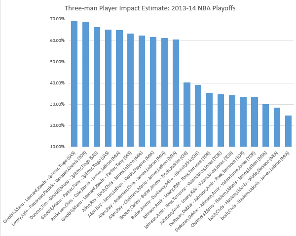
Below are the best and worst three-man line-ups in the playoffs as of last night's game based on player impact estimate (PIE) and net rating (both standardized per 48 minutes of play). I pulled data from NBA stats (which limits each combination of three-man line-ups to 250).


As expected, three-man rotations from either the Spurs or the Heat take all of the top ten positions, with the exception that Lowry, Patterson and Vasquez, who had the second highest PIE. The ten worst PIEs are dominated by Bulls and Raptors, two first round exits. Surprisingly, the three worst PIEs are Heat rotations that include Udanis Haslem.


The net rating chart essentially mirrors the PIE chart with the exception that Lowry, Patterson and Vasquez dropped from second to sixth best. The fact that Udonis Haslem is the consistent piece (with otherwise extraordinary players) in the three worst PIEs and net rating for these playoffs signals the value of Chris Andersen's return (not necessarily because he is so valuable, but because Andersen is simply not Haslem).

Friday, May 9, 2014

2013-14 Distance-Adjusted FG%

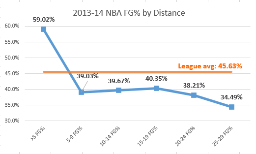
There are several advanced measures of field goal percentage (FG%), such as effective FG% (eFG%) and True Shooting % (TS%) that add value for made three point FGs (3FGMs), in the case of eFG%, or 3FGMs and free throws (FTs), in the case of TS%. But I have not encountered any measure that takes into account distance. Presumably the further the field goal attempt (FGA) from the basket the lower the likelihood that the attempt is made. I pulled 2013-14 regular season data from NBA Stats on FG% by distance and plotted the results below. The league FG% (orange line) is 45.6%. FG% is highest within 5 feet of the basket (59.0%) then drops 20 percentage points once a shot is attempted from 5-9 feet from the basket and hovers around that level for all attempts within 24 feet. Attempts from 25-29 feet drop to the lowest FG% by a five foot increment (34.5%).


I wanted to standardize FG% based on distance so I used the FG% from within five feet of the basket as the base. Then I established a factor for each five foot increment based on the league-wide FG% within five feet divided by the league-wide FG% in a given five foot increment. The orange line in the chart below shows that in the 2013-14 NBA season, players were 1.51 times more likely to make a shot from less than five feet than they were from 5-9 feet from the basket. Likewise they were 1.71 times more likely to make a shot from less than five feet than they were from 25-29 feet from the basket.


I then applied the distance factor to each player's FGMs by five foot increment. I kept the FGA for each increment the same, thus the distance factors would inflate the FGMs and FG%. (In other words, for every play from 5-9 Feet I multiplied their FGMs by 1.51.) The chart below illustrates the effect this distance-weighting had on John Wall. As a guard he attempts more shots from further away from the basket so such a weighting system is expected to increase his FG% considerably (and, sure enough that is what happened). In weighting his FGMs based on the distance factors for each five foot increment (column DAFGM), Wall's Distance Adjusted FG% (DAFG%) increases for every five foot increment with the exception of less than five feet, which serves as the basis. Overall his FG% increases from his actual percentage of 43.7% to a DAFG% of 57.1%.


To give some scope on why it is worth considering a DAFG%, look at the chart below of the top ten and ten worst FG%s from 2013-14 (minimum 100 FGAs). All of the top FG% players are centers that only take shots close to the basket, and the worst FG%s are guards that rely more on longer jump shots.


The next chart shows the top ten and ten worst DAFG%s from 2013-14 (minimum 100 FGAs). While many of the poor shooting guards from the above chart remain, several guards and jump shooting forwards, like Korver, Nowitzki, Miller, Prigioni, Pargo and James, emerge as top distance-adjusted shooters.


Finally, it is important to understand the relationship between FG% and DAFG%. The chart below, which includes an orange linear regression line, illustrates that the two are highly correlated. Another way to interpret this, is that DAFG% does not revolutionize how we understand shooting efficiency. It largely reinforces what conventional measures already tell us. But, the chart immediately above shows that DAFG% also can grant insight on especially efficient guards and forward, who may not be recognized by conventional FG% measures simply because they take longer shots.

Saturday, April 19, 2014

2013-14 Rookie Player Impact Estimates

Among the many measures aimed at capturing a player's overall value to a team (i.e., PER and WARP), NBA Stats uses Player Impact Estimate (PIE)*. The statistic combines a range of conventional stats and standardizes them per game. With the regular season complete I wanted to take a retrospective look at rookie performance and do some simple forecasting to see which players might excel in their sophomore season. I pulled PIE data from NBA Stats for all rookies that played at least 10 minutes per game. The first chart presents the results. Interestingly, based on PIE, top overall pick Anthony Bennett was actually the worst rookie in the 2013-14 season, and seventh overall pick Ben McLemore wasn't much better. The top performing rookies included Gorgui Dieng, Mason Plumlee, Michael Carter-Williams and Victor Oladipo. The latter two were effective consistently throughout their rookie years, Diegn and Plumlee came on strong during the last two months of the season.


Next, I wanted to get an idea of how PIE might predict performance among the 2013-14 rookies in their 2014-15 sophomore season. I collected data on the April PIE for 2012-13 rookies (i.e., the Anthony Davis class) and compared it with their full season PIE from their 2013-14 sophomore season. I captured only players from the 2012 draft class that played registered a PIE in April 2013 and registered a PIE for 2013-14, which resulted in 56 players (actually 57, but I dropped Robert Sacre and his -200% PIE for April 2013, which reflected 1.6 of the worst minutes of basketball in the 2012-13 season). 

My thinking is that by April, the last month of the regular season, rookies have become accustomed to the NBA game. As a result, it represents a good focal point to project performance into their sophomore year. (I'm hesitant to project anything over the long-term based on rookie performance as their are players, like Steve Nash, that need a few years to adjust to the NBA game.) I included a linear regression line, which indicates a positive correlation between rookie year April PIE and sophomore season PIE. (The anomalous point that is about 15% for his rookie season and 16% for last April is, of course, Anthony Davis.)

Finally, I pulled April PIE data for this season's rookies. The top twenty are listed below. If April's performance holds, we can expect that Carter-Williams, Plumlee, Olynyk, Diegn and Oladipo to lead next year's sophomore class. (In April, Dieng averaged a double-double in points and rebounds plus two blocks per game; Olynyk averaged almost 17 points and 7 rebounds a game while shooting 55%.)


Friday, April 4, 2014

Conventional Stats that Matter

With a growing focus on advanced statistics and measures, some analysis disregards conventional playing statistics, like steals, points or field goal attempts. But many "advanced" stats are based largely on conventional measures. For example, effective field goal %; (eFG%) simply places greater weight on three point made baskets to account for their value. More complex advanced stats, like PER, combine a range of individual and team conventional statistics, like assists, rebounds, steals, FG%, etc.

Now this isn't to say that advanced stats are deficient in any way. In many cases they are superior measures of performance--because of their ability to account for more than a single measure of play, like just rebounds, or just points--but conventional statistics are of intrinsic value.

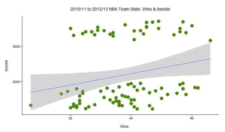
I collected team data from the last three full NBA seasons (2011-12 was cut short 16 games by a collective bargaining agreement work stoppage) and included all conventional team stats from basketball-reference.com (for example . . . ). Next, I cheated and ran a correlation matrix to determine those conventional statistics most correlated with winning and most correlated with losing. Below are charts that show the two conventional statistics most correlated with winning and the one conventional statistic most correlated with losing. (Wins over these three seasons are plotted on the horizontal axis for the first two charts; losses are plotted on the horizontal line for the third chart.)

For each chart I included a linear regression line (blue line) with a 95% confidence region (grey area). The line and grey area give some indication of the relationship between wins and each conventional statistic. The upward slant of the regression line indicates a positive correlation between blocks (first plot) and assists (second plot) with wins. In other words, blocks and assists, rather than FG%, points, or rebounds might represent the most important indicator of a team's success (as measured by regular season wins) 


When I ran the correlation matrix, the conventional statistic most highly correlated with losing was fouls. While the association between blocks and assists with winning and fouls with losing does not necessarily hold with individual players, there is some evidence that at the team-level these are critical conventional statistics.

Sunday, March 23, 2014

2013-14 Player Salary per Win Share (as of March 22)

I wanted to update the list of most cost-effective contracts in the NBA through so I pulled player advanced stats and salary data from Basketball-Reference.com on March 22. As a rough measure of player efficacy I used Win Shares (WS), which attempts to estimate the number of wins a player contributes to his team in a given season (read this for Basketball-Reference's detailed explanation of the measure). I divided the player's 2013-14 salary by WS to determine, which player contributes the greatest number of wins to his team at the lowest cost to the organization. For some reference, the average cost per WS was $1,551,542 and the median cost per WS was $1,427,214.

Typically, I standardize statistics as per minute or per 48 minutes of performance to take into account for the fact that players that play more minutes also are likely to accrue more statistics than players that play fewer minutes. (Basketball-Reference.com does provide WS per 48 minutes.) But taking salary into account changes the dynamics because a player receives his salary regardless if he plays 30 minutes a game or if he plays 2 minutes a game. As a result, the organization benefits from total WS (as opposed to WS/ 48) because the player receives his full salary and not some prorated amount based on performance.

I filtered the population of 2013-14 NBA players to those that have played 100 minutes or more, which left me with 422 players. The chart below shows the full spectrum of those 422 players: Ekpe Udoh is the most expensive per WS and Isaiah Thomas is the least expensive per WS. Among the 39 qualifying players with a negative WS, Kobe Bryant comes at the greatest cost to his team (i.e., his contract in 2013-14 is very burdensome and when he plays he has a negative effect on his team's chances of winning a game--this is a bad thing.)


First, the good--the table below lists the 10 most cost-effective contracts this season in reverse order. When taking salary into account, this table suggests that Isaiah Thomas, Lance Stephenson, and Chandler Parsons are the best players this season. To give you some context of cost/ WS of other notable players, consider: LeBron ($1.45M), Durant ($1.05M), Deron Williams ($4.01M), Kevin Love ($1.13M), and John Wall ($1.04M).


The five least cost-effective contracts of players with a positive WS are listed below. Ekpe Udoh and Charlie Villanueva have the most cost-ineffective contracts. But they're not the worst . . .
 

While the 5 most cost-ineffective players listed above prove burdensome on the financial well-being of their organizations, they all at least contribute to WS. Among players that have played at least 100 minutes in the 2013-14 NBA season, there are 39 players with a negative WS. In other words, when they are on the floor they actually hurt their team's chances of winning. It's one thing to be Jason Terry or Aaron Gray and to be paid a lot to help a little, it's another thing to be paid a lot and to hurt one's team. The table below shows that Kobe, Derrick Rose and OJ Mayo are the greatest offenders of this latter group. Ignoring injuries to players, like Bryant and Rose, from a cost-efficacy standpoint there is evidence to suggest that through March 22, OJ Mayo is the most burdensome player in the NBA.