Monday, June 30, 2014

Why LeBron leaves

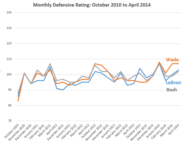
I pulled monthly split stats from Basketball-Reference.com on LeBron, Dwade and Bosh going back to the three's first season with the Heat. Below I charted their monthly offensive rating (an estimate of the points produced by a player per 100 possessions) and defensive rating (an estimate of the points allowed by a player per 100 possessions). Because these three are all starters and play the bulk of the Heat's minutes together, you would expect their ratings to mirror each other (the calculations takes into account several team statistics).

Offensively, over the last two years LeBron has really begun to distance himself from the other two. Further, DWade has exhibited a noticeable decline that began March 2013. Defensively, the three stars follow a much closer path, but again DWade appears to struggle recently more so than the LeBron and Bosh (in the bottom chart, as it is preferable to allow fewer points, the lower the line the better). Should LeBron stay in Miami these charts suggest he will be expected to carry an increasing load for the other Big Two as their performance wanes.

Saturday, June 21, 2014

Spurs, passing & distance

There was much emphasis--and a surprising number of highlights and GIFs--on the Spurs' exceptional passing during this season's championship run. For the first playoffs in history, the NBA used SportVU technology to report on spatial statistics that offer insight on statistics like passes per game, distance traveled, and other possession-based information not easily captured by conventional measures, like points, rebounds, etc.

The chart below breaks out passes per game for the 2013-14 NBA playoffs. The Spurs were third from the best, and clearly passes per game doesn't seem to determine success as the Bobcats are second and more successful playoff teams, like the Heat, Pacers, and Thunder are toward the bottom.


The following chart compares 2013-14 playoff win percentage with passes per game. The orange trend line actually goes down, which signals a negative correlation between win percentage and passes per game. In other words, more passes per game does not seem to equate with winning. (The R-squared number is a signal of model fit. The closer it is to 1 the better the data fit. In this chart the low R-squared signals that trend/ regression line does a poor job of approximating the data. If all the points hovered on or around the trend/ regression line then the R-squared number would be higher.)


When I looked at other spatial data that NBA Stats provided, there was one that the Spurs proved exceptional--distance traveled per game. The chart below shows the distance (in miles) traveled by the Spurs' players on the court per 48 minutes. The Spurs traveled almost a full mile more per 48 minutes than the next most traveled teams, the Trail Blazers, the Bulls and the Bobcats, and almost two miles per game more than the Pacers.


The chart below illustrates the relationship between distance traveled per 48 minutes and win percentage. The trend line indicates a slightly negative correlation and the R-squared shows even poorer model fit than the prior. The Spurs are an anomaly in the upper right hand corner of the chart. This chart simply shows that while distance traveled may have proved beneficial for the Spurs, it had no correlation on success in these playoffs for the other 15 teams.


While I did not find any spatial team measure that explained team success, these basic models are limited by the fact that there is a sample size of only one playoff. As the NBA continues to collect this data in future seasons, there will be more information so it will become easier to distinguish if meaningful relationships exist between measures of success, like winning, and spatial measures. Further, simple two variable models, like the two above, ignore a range of factors, like opponent, offensive and defensive schemes, etc that if accounted for would help clarify the actual relationship between passing or distance and success.